In 2016, Quest Apartment Hotels engaged prominent design studio Zunica to review and revamp the Quest furniture, fixtures and equipment (FF&E).
The decision to reimagine the document, which underpins the FF&E fit-out for every new Quest Apartment Hotel, preceded the most rapid and sustained period of growth in the company’s thirty-year lifespan.
From 2016 to 2020, Quest maintained an average of 8 new property openings per year in Australia alone.
Today, Quest Apartment Hotels remains to be Australia’s pre-eminent corporate travel brand, with a consumer-centric furniture, fixtures and equipment response, which is equal parts consistent, contemporary, contextual, and considered.

Speaking with designer Andrew Zunica, Quest’s Chief of Project Delivery, Tom Lehmann, and Senior Design Manager, Nicolas Dingle, we unpack the unique formula that has travellers checking in at Quest time again, with reference to the newest properties in the company stable, Quest Preston and Quest Perth Ascot.
Consistent
Quest seeks to create a home away from home experience for guests across all 170+ properties globally. But how is a sense of home created, particularly for the globe-trotting corporate traveller?
Founding Principal of Zunica Design, Andrew Zunica, says home is a place where one feels at ease, familiar with their surroundings and comfortable. To capture this ambience and ensure Quest guests felt truly at home, he maintains consistency is not merely key, but crucial.
“Guest experience, and thus guest loyalty, is the most essential component for Quest and the very reason a fastidious furniture, fixtures and equipment brief, with the capacity for consistent yet nuanced application was essential. Every property must capture and convey a clear and inimitable sense of Quest, so guests feel instantly acclimatised with their physical surround and relaxed, as they would at their own home,” said Zunica.

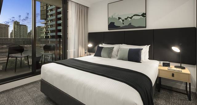
Despite being more than 3,000 kilometres apart, new properties Quest Preston and Quest Perth Ascot encapsulate the brand’s commitment to consistency, where guests will stay in synonymous style.
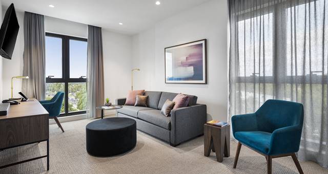
“The spaces are clean, minimalist and modular, accented by an inviting colour palette of warm neutrals and greys”, said Quest’s Senior Design Manager, Nicolas Dingle.
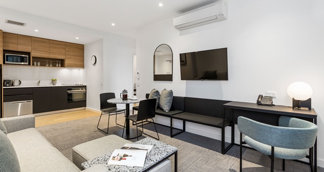
“Our interior architecture follows a consistent brief, too, which means that the furniture, fixtures and equipment fit-out can follow a uniform rhythm. For example, the dining tables in our apartments will all be of similar dimensions, located roughly the same distance from the kitchen itself, and the dining space will be clearly visible from the lounge area. These subtle consistencies are perhaps never plainly observed by the guest but applied frequently enough feed into the archetypal sense of home we aspire for”.
Contemporary
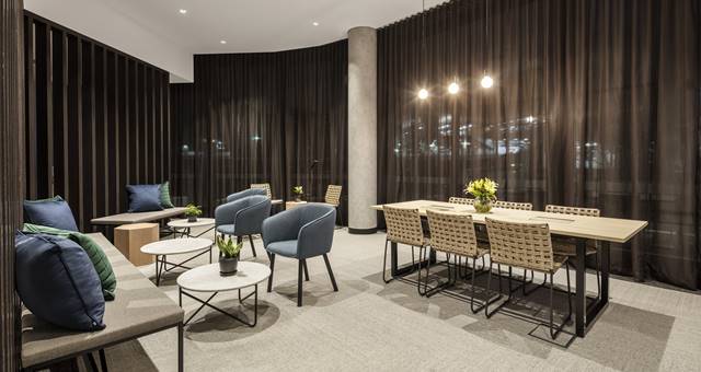
Demanding more space, flexibility and character, today’s corporate traveller needs a contemporary environment where they can work autonomously and with colleagues. Quest’s in room workstations are the perfect nook for some late-night toil, while business lounges and conference rooms provide areas for events and group meetings.
“It’s ultimately about breaking down barriers between guest rooms and common spaces to exude a feeling of freedom and spaciousness, but also to ensure the guest experience is incredibly practical”, said Andrew Zunica.
What Quest also knows about the corporate traveller is that they want to maintain routine and enjoy in a bit of leisure time where they can. Efficiently designed, fully equipped gymnasiums, swimming pools, outdoor entertainment areas and more mean guests can maintain healthy habits and socialise during their stay.

“Guests rightly expect more from hotel operators today than ever before, and that goes for absolutely every facet of the guest experience”, said Quest’s Chief of Project Delivery, Tom Lehmann.
“By remaining abreast of changes in consumer behaviour, technology and design trends, and while our furniture, fixtures and equipment brief remains to be our source of truth and consistency, with every new project we find ourselves tweaking and improving things ever so slightly to ensure that what we deliver is a reflection and extension of the guest’s world”.
Contextual
Every Quest property is architecturally designed to respond to its unique context, paying homage to the neighbourhood fabric.
Embracing the artful application of phenomenology, the furniture, fixtures and equipment of each Quest property has bespoke character with subtle design references to local history, icons and surrounds.
Quest Preston, situated in Melbourne’s eclectic north, rich in industrial history, is a prime example.
Quest Perth Ascot typifies the brand’s considered ethos, where apartments are furnished with robust and sleek dining tables, terrazzo-topped coffee and bedside tables and modular lounge pieces.
“When we embark on a new project, we first undertake a local site analysis, exploring the personality and charm that makes every locale unique”, said Andrew Zunica.
“In the case of Quest Preston, our muse with the Victorian era workers’ cottages, and time-worn industrial spaces, which collectively struck this balance of grit, texture and antiquated charm”, he added.

“At Quest Preston we have also added a striking perforated metal ceiling in the lobby and also used flecks of black, metal and distressed wood”, added Nicolas Dingle, speaking of the interior architecture.
“This is all complemented by a beautiful series of bespoke artworks captured by the Zunica team during their local site analysis, so when guests stay at Quest Preston, they can really immerse themselves in the story of Melbourne’s north”, he added.
Considered
If a considered space is one which limits wastage, prioritises the guest experience, arrives on time and is within budget, then Quest Apartment Hotels has the winning formula.
According to Andrew Zunica, Quest’s design ideology is anchored by efficiency and modularity, both of which satiate the commercial requirements of establishing a new hotel, but also lead to a more pleasing experience for travellers.
“When we are working on the furniture, fixtures and equipment responses for each property, we look at how we can we block and stack to achieve a neat, clean and functional response that is neither sterile nor unnecessarily detailed”, said Andrew Zunica.
“Rather than having say 30 pieces of furniture in a room, we limit ourselves to maybe half a dozen, and really consider if, how and in what manner the guest would make use of the item. Not only does this reduce wastage, but it allows us to invest in higher quality furnishings that will stand the test of time and be easy to repair and maintain throughout their lifespan”.

